APEX
Apex Water Solutions specializes in advanced water treatment services for the oil and gas industry, focusing on sustainable and effective solutions. The project involved rebranding their legacy to a more modern look.
Client name:
Apex Water Solutions
Partners:
Be Creative Studio
overview
Apex Water Solutions specializes in advanced water treatment services tailored for the oil and gas industry. Their mission is to provide high-quality, technology-driven solutions that balance economic success with environmental responsibility, ensuring effective water management and treatment.

THE CHALLENGE
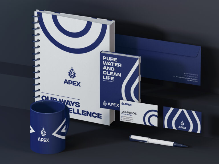
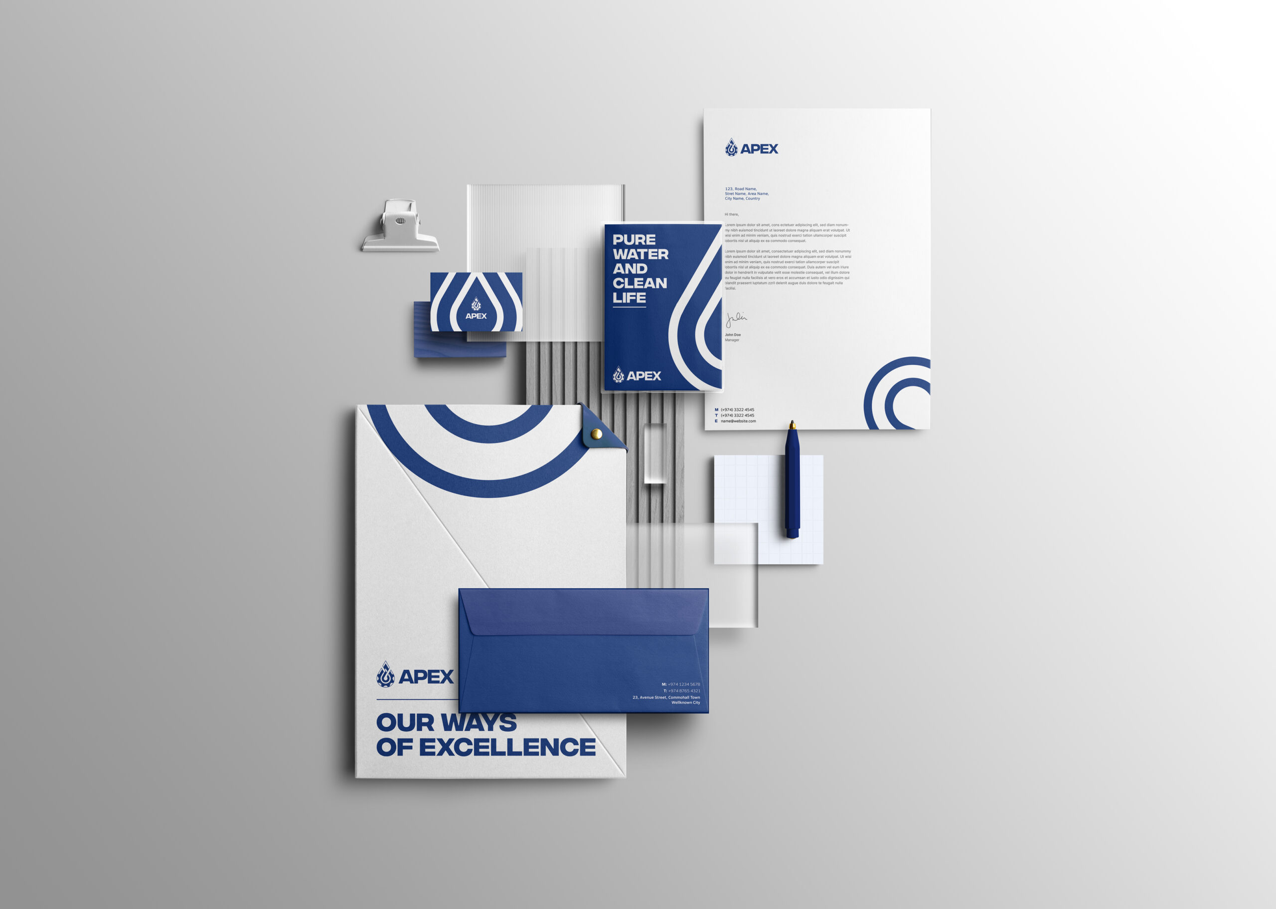
The challenge was to refresh an outdated logo while preserving the original concept of integrating a gear and a water drop. This required modernizing the design into a minimal, corporate format that symbolizes the fusion of water treatment technology and machinery. Additionally, a complete brand identity was developed to align with their corporate vision.
Logo Rationale
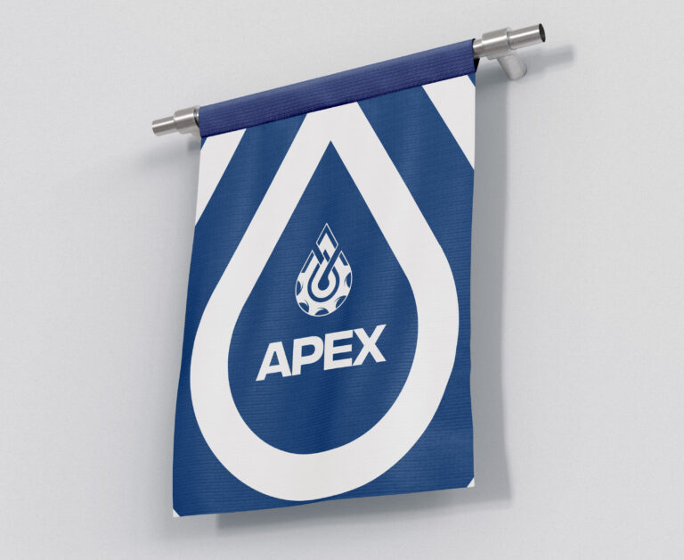
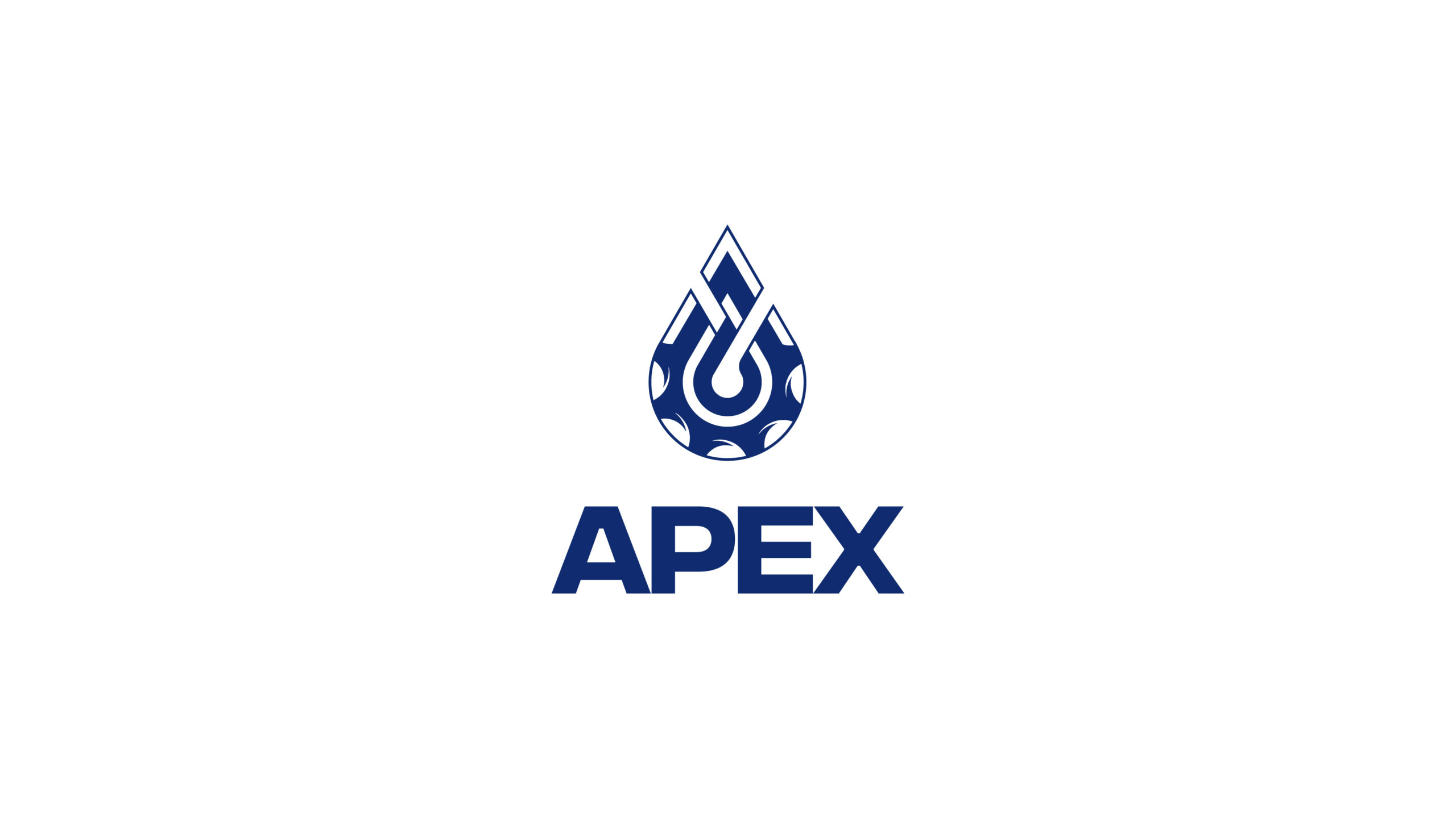
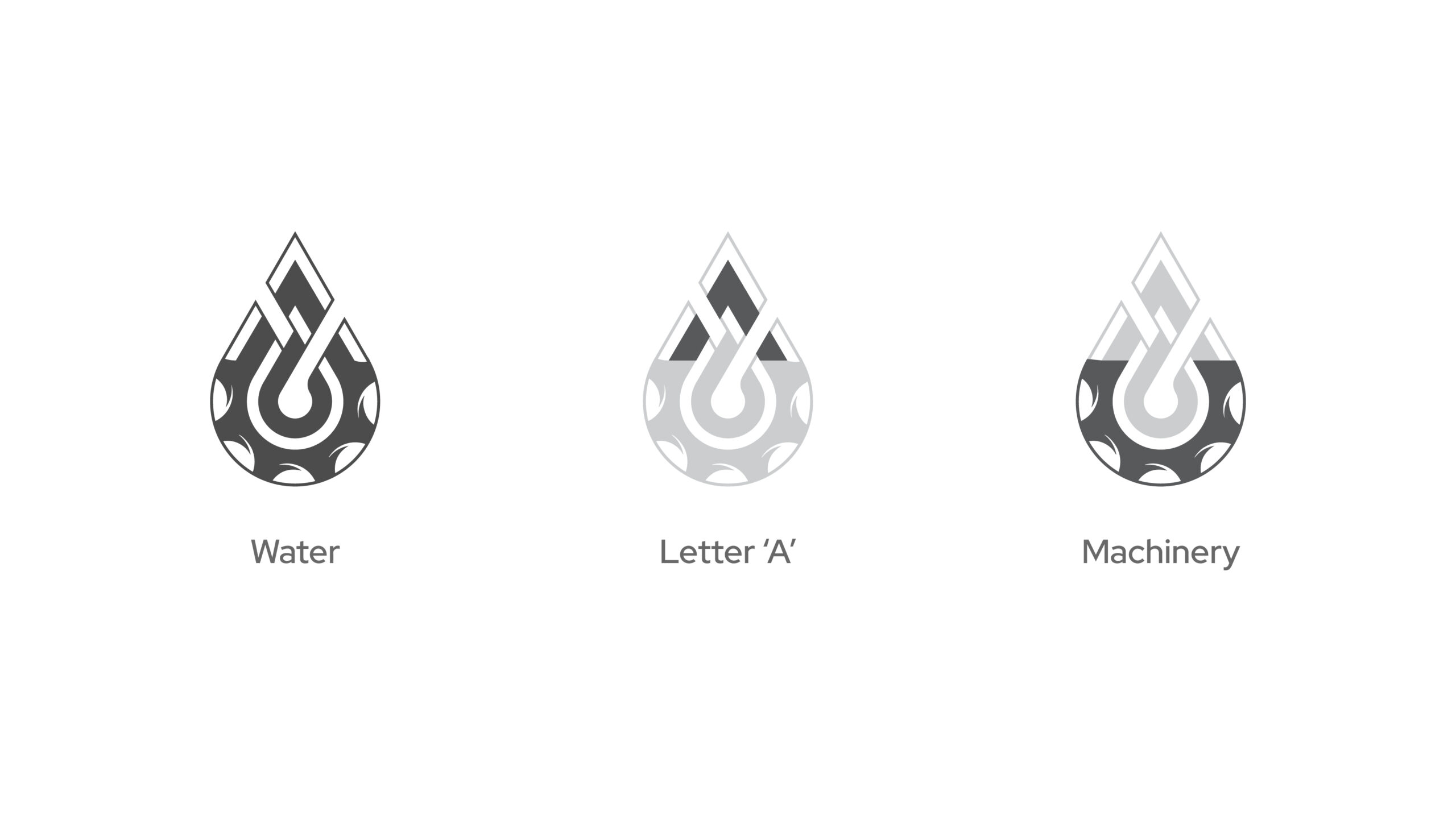
The updated logo for Apex Water Solutions is a fusion of four elements: a gear, symbolizing the industrial and technological aspect of the company; a water drop, representing their core focus on water treatment; and the letter “A,” subtly embedded to maintain brand recognition. The design achieves a minimalist, corporate look, aligning with Apex’s professional identity while honoring the legacy of the original logo.
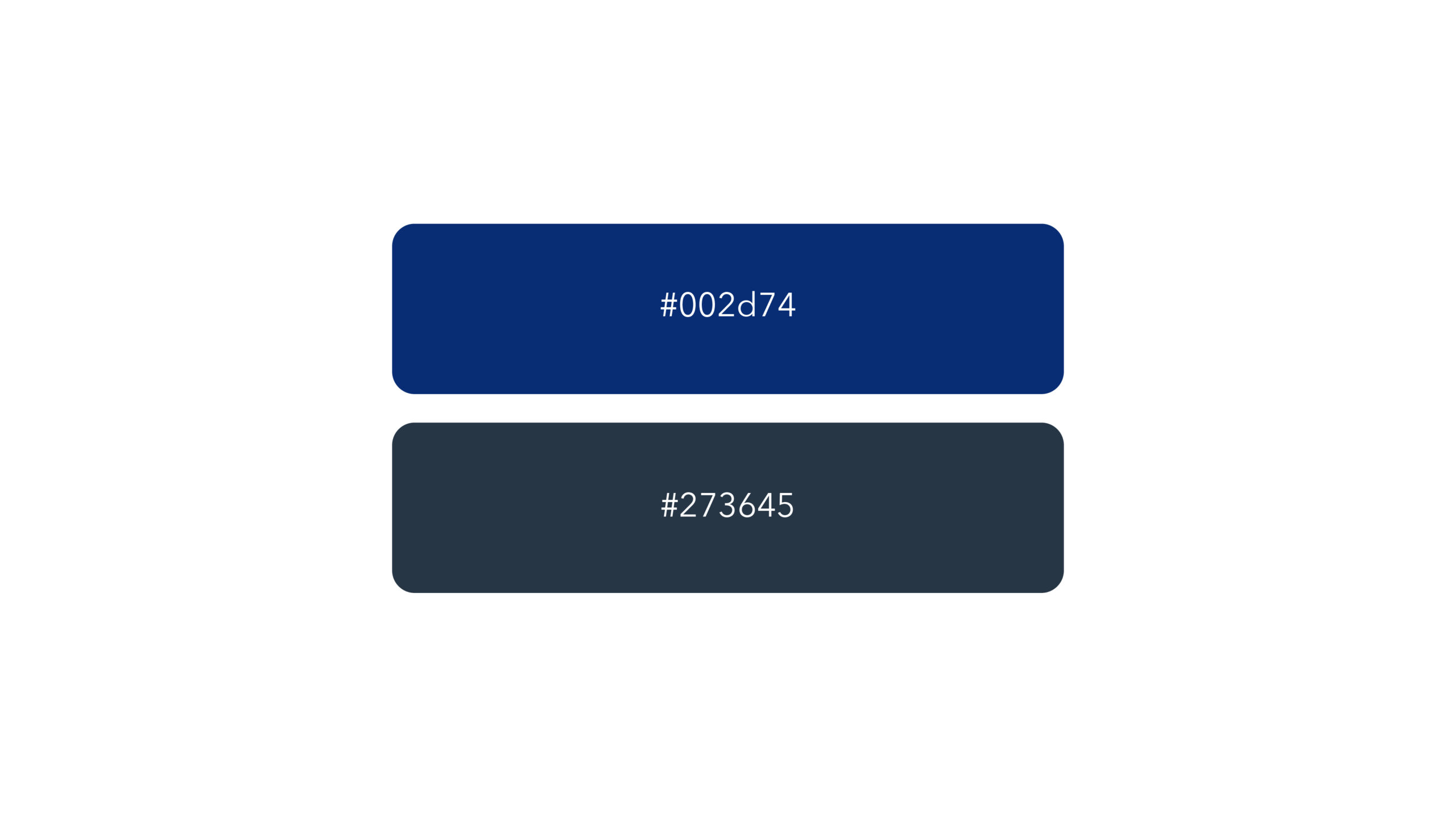
Color Palette
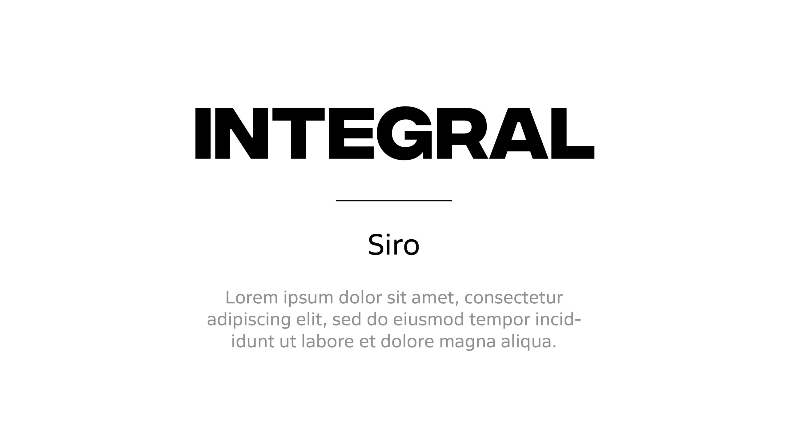
Typography
Visual Language
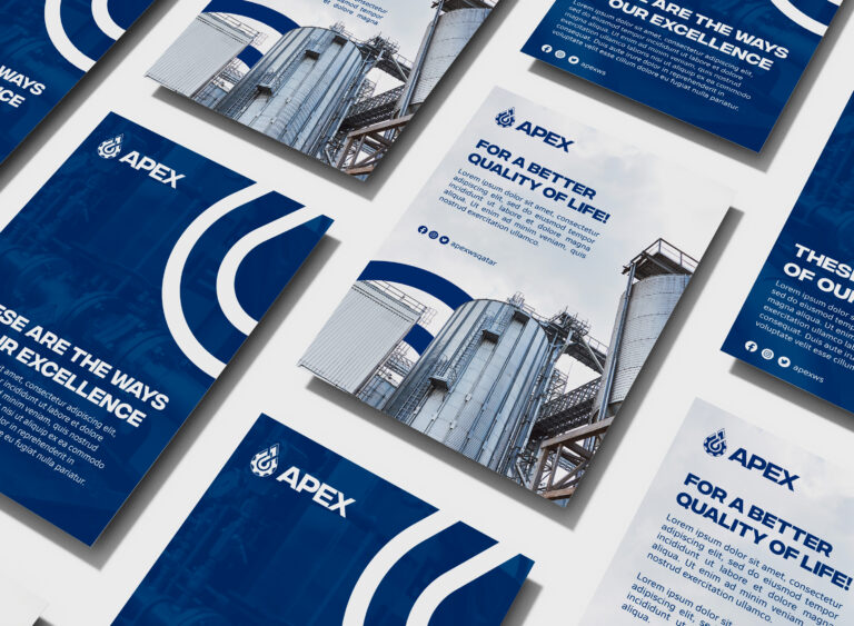
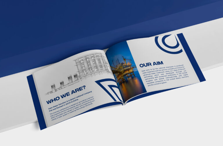
The visual language is clean and minimal, representing the purity and clarity of water—a key element of Apex’s brand identity. This approach highlights the company’s commitment to providing clean, effective water treatment solutions while maintaining a professional and industry-focused aesthetic. The minimalism in design further emphasizes the precision and efficiency that Apex brings to its services.
