APEX
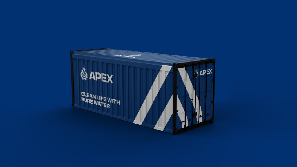
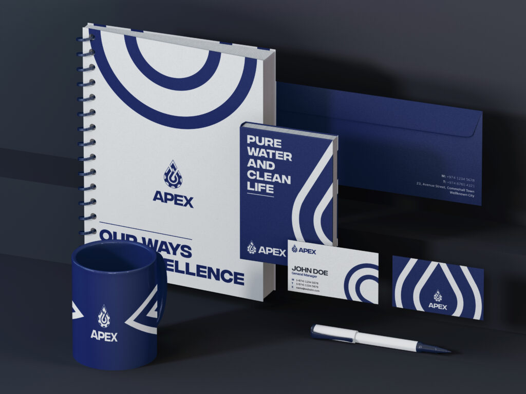
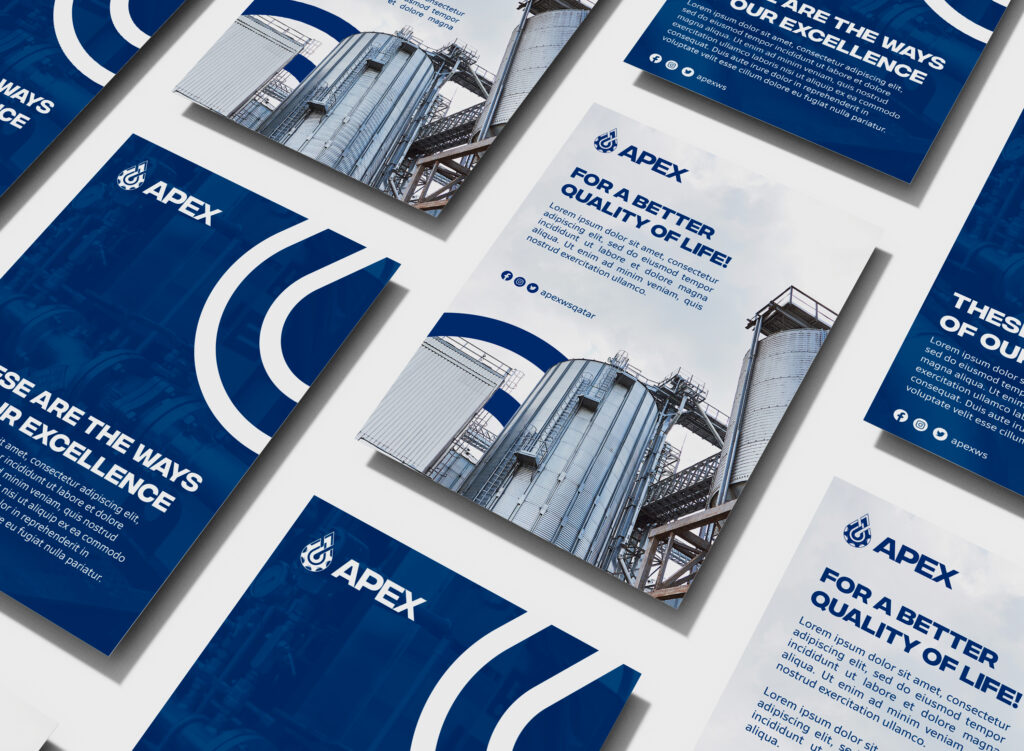
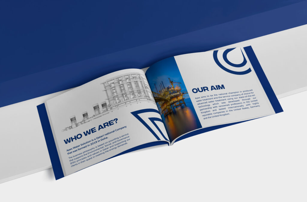
Apex Water Solutions specializes in advanced water treatment services for the oil and gas industry, focusing on sustainable and effective solutions. The project involved rebranding their legacy to a more modern look.
Client name:
Apex Water Solutions
partners:
Be Creative Studio
Logo concept
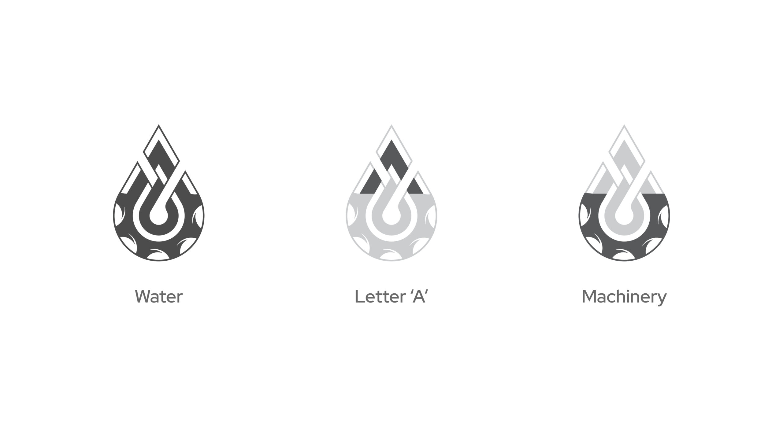
The updated logo for Apex Water Solutions is a fusion of four elements: a gear, symbolizing the industrial and technological aspect of the company; a water drop, representing their core focus on water treatment; and the letter “A,” subtly embedded to maintain brand recognition. The design achieves a minimalist, corporate look, aligning with Apex’s professional identity while honoring the legacy of the original logo.


Logo OFFICIAL
The main logo is a well proportioned design, featuring multiple hints relating to the brand while keeping it simplistic and still resembling parts of the old brand logo.
Apex Water Solutions specializes in advanced water treatment services tailored for the oil and gas industry. Their mission is to provide high-quality, technology-driven solutions that balance economic success with environmental responsibility, ensuring effective water management and treatment.
Logo rationale
The refreshed logo for Apex Water Solutions combines four key elements that capture the company’s core focus. A gear represents its industrial and technological expertise, while a water drop emphasizes its dedication to water treatment. Discreetly included is the letter “A,” preserving brand recognition. The minimalist design reflects a clean, corporate look that aligns with Apex’s professional identity, while still respecting the legacy of the original logo.
Color rationale
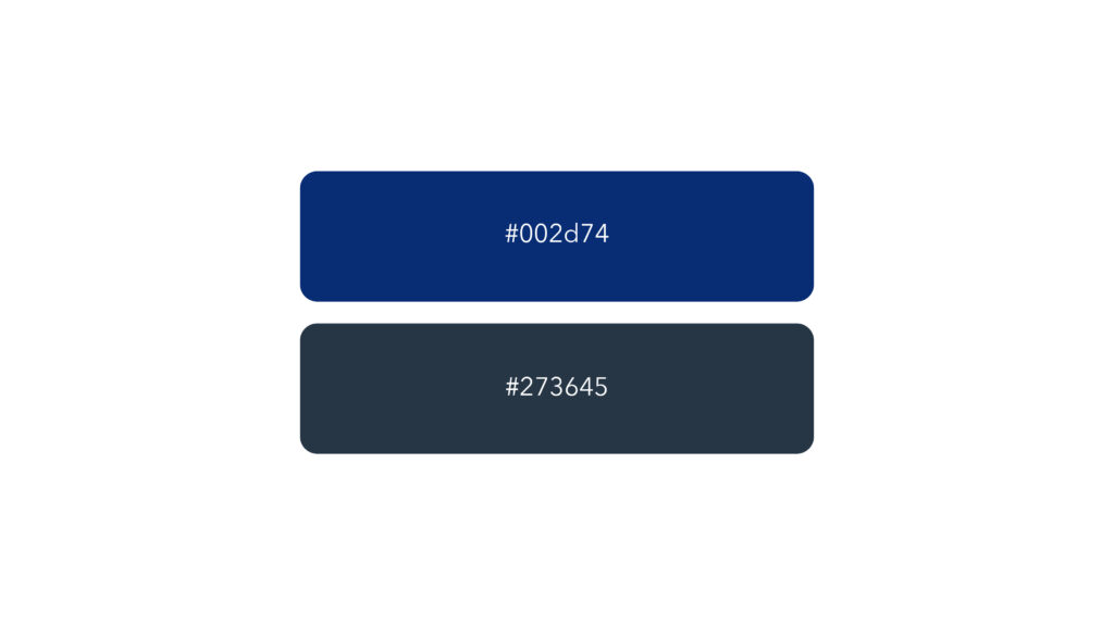
The colors blue and grey were chosen for their symbolism and professional appeal. Blue represents water, reliability, and trust—key values for a water solutions company. Grey adds a sense of industrial strength and sophistication, reflecting the company’s technological expertise and professionalism. Together, they create a balanced and modern look.
