CATES
Cates offers high-protein snacks made from date cookies, appealing to children, athletes, and health-conscious individuals as well. Based in Qatar, the aim was to create a brand as irresistible as their nutritious treats.
client name
Cates Cookies
Partners
Be Creative Studio
overview
Cates, specializing in high-protein snacks made from dates, aimed to create a brand that appeals to both children seeking healthy snacks and athletes needing protein-rich options. The challenge was to merge the irresistible appeal of cookies with the nutritional benefits of dates into a balanced and appealing product line. Cates needed their branding to be as universally appealing as their product—a snack that no one can resist.
THE CHALLENGE
Cates, specializing in high-protein snacks made from dates, aimed to create a brand that appeals to both children seeking healthy snacks and athletes needing protein-rich options. The challenge was to merge the irresistible appeal of cookies with the nutritional benefits of dates into a balanced and appealing product line. Cates needed their branding to be as universally appealing as their product—a snack that no one can resist.
Logo Rationale
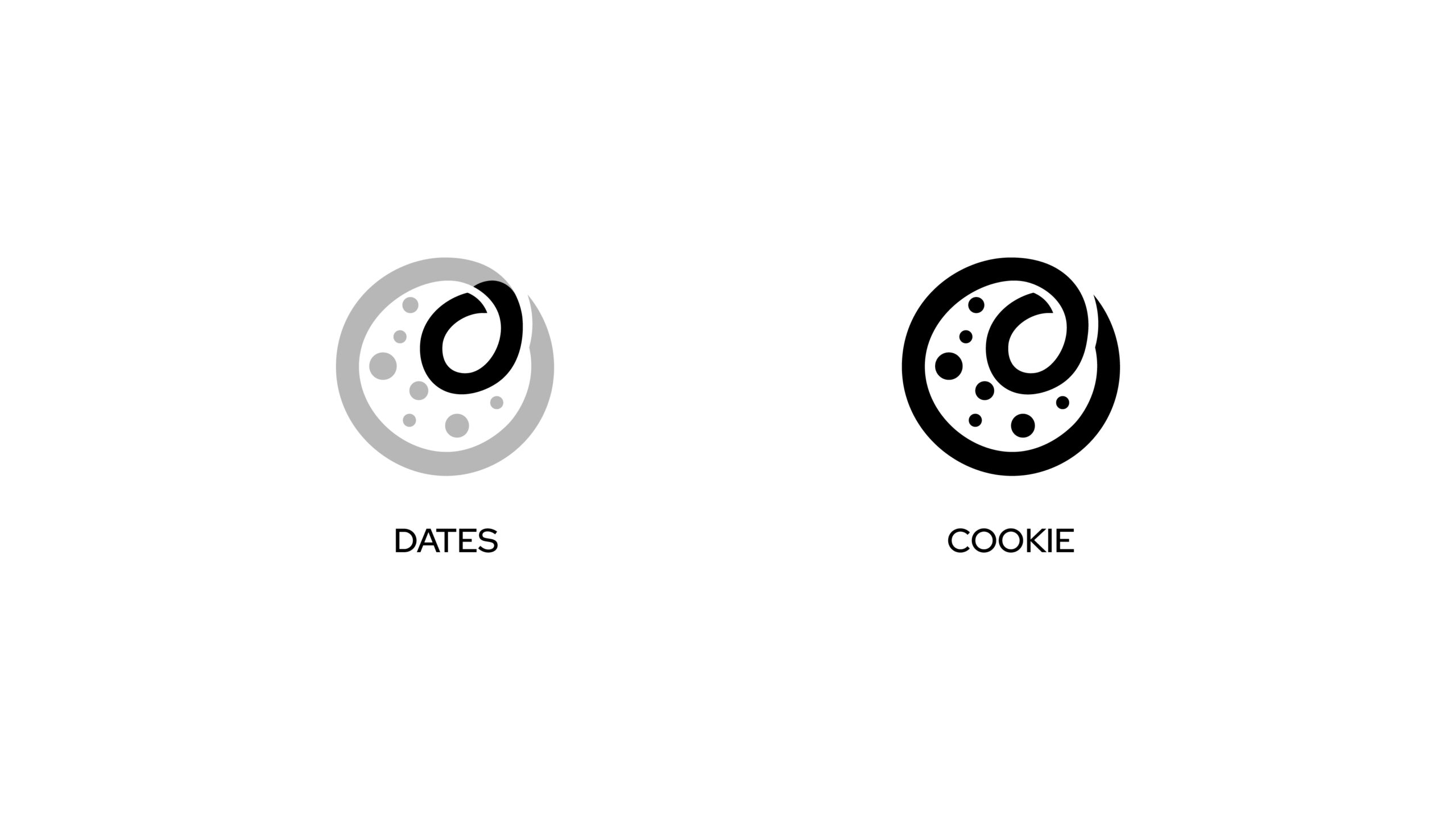
The Cates logo combines a cookie and a date, forming a cursive ‘C.’ This design the signature product and reflects our commitment to healthy, delicious snacks – by enclosing all that is needed into one simple emblem. The logo captures the core of Cates: a blend of taste and creativity.
Color Palette
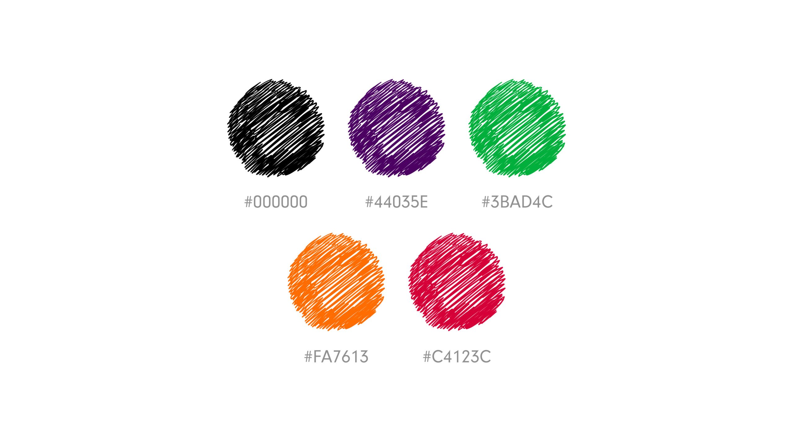
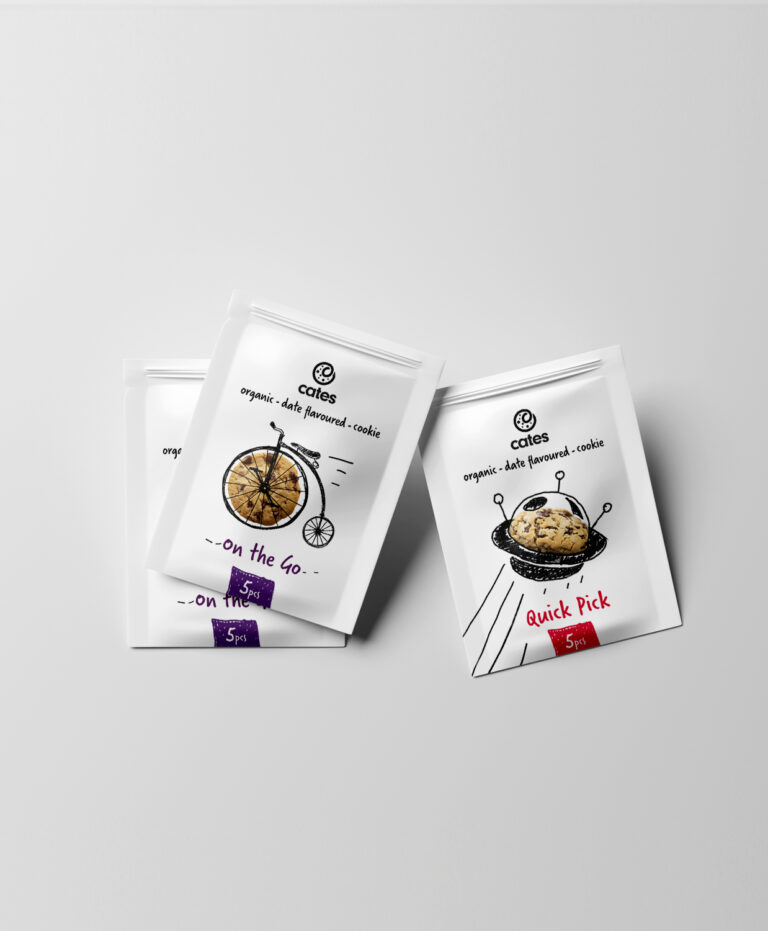
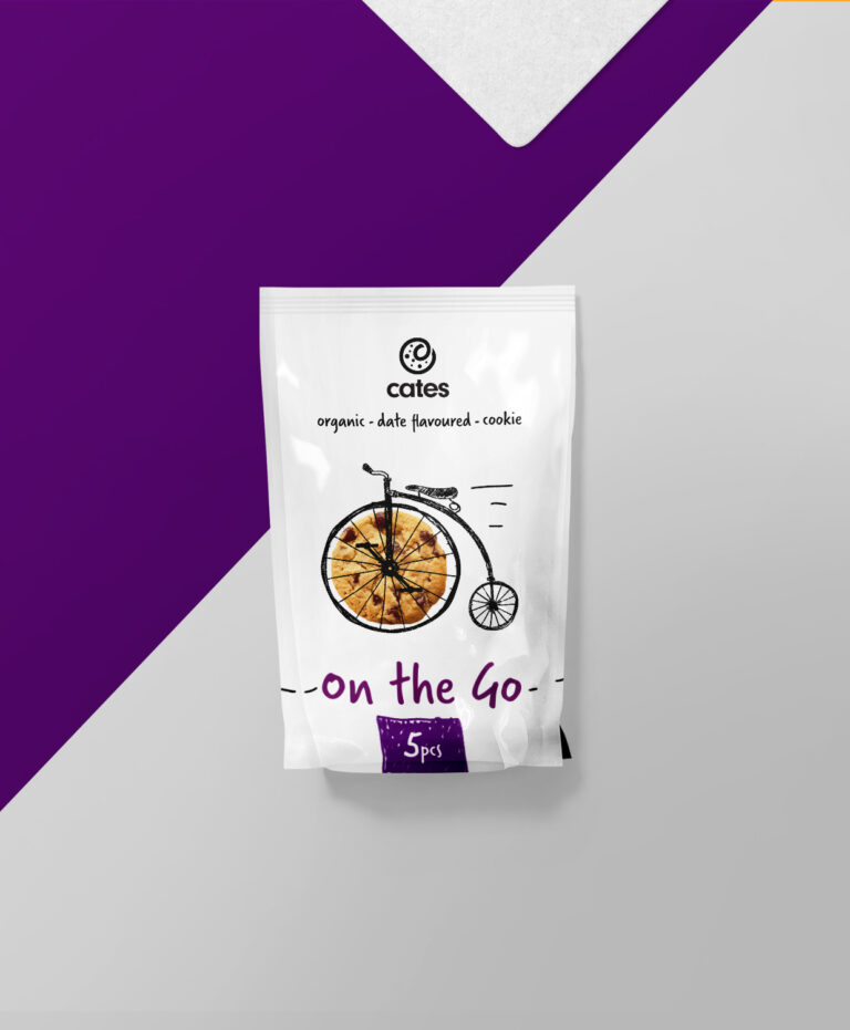
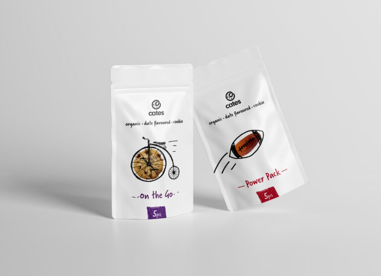
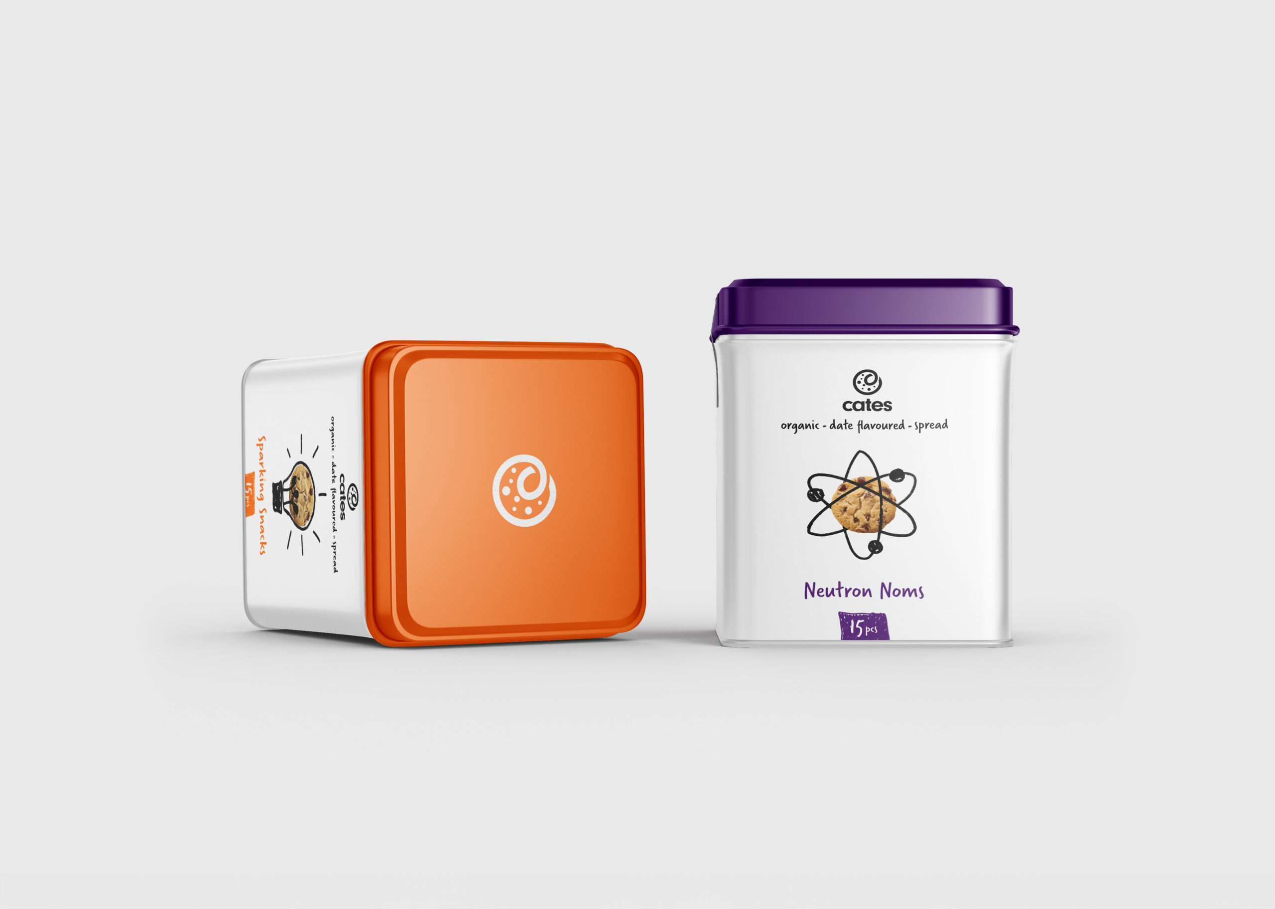
The palette uses black as a universal base. Secondary colors are strategically chosen to target specific audiences: purple for a broad appeal as it symbolizes creativity, orange to attract children with its burst of energy and excitement, red for athletes with its feel of energy, and green for health-conscious individuals as it resembles nature and health. These colors are selected to align with the distinct preferences and motivations of each audience segment, enhancing the overall brand experience.
Typography
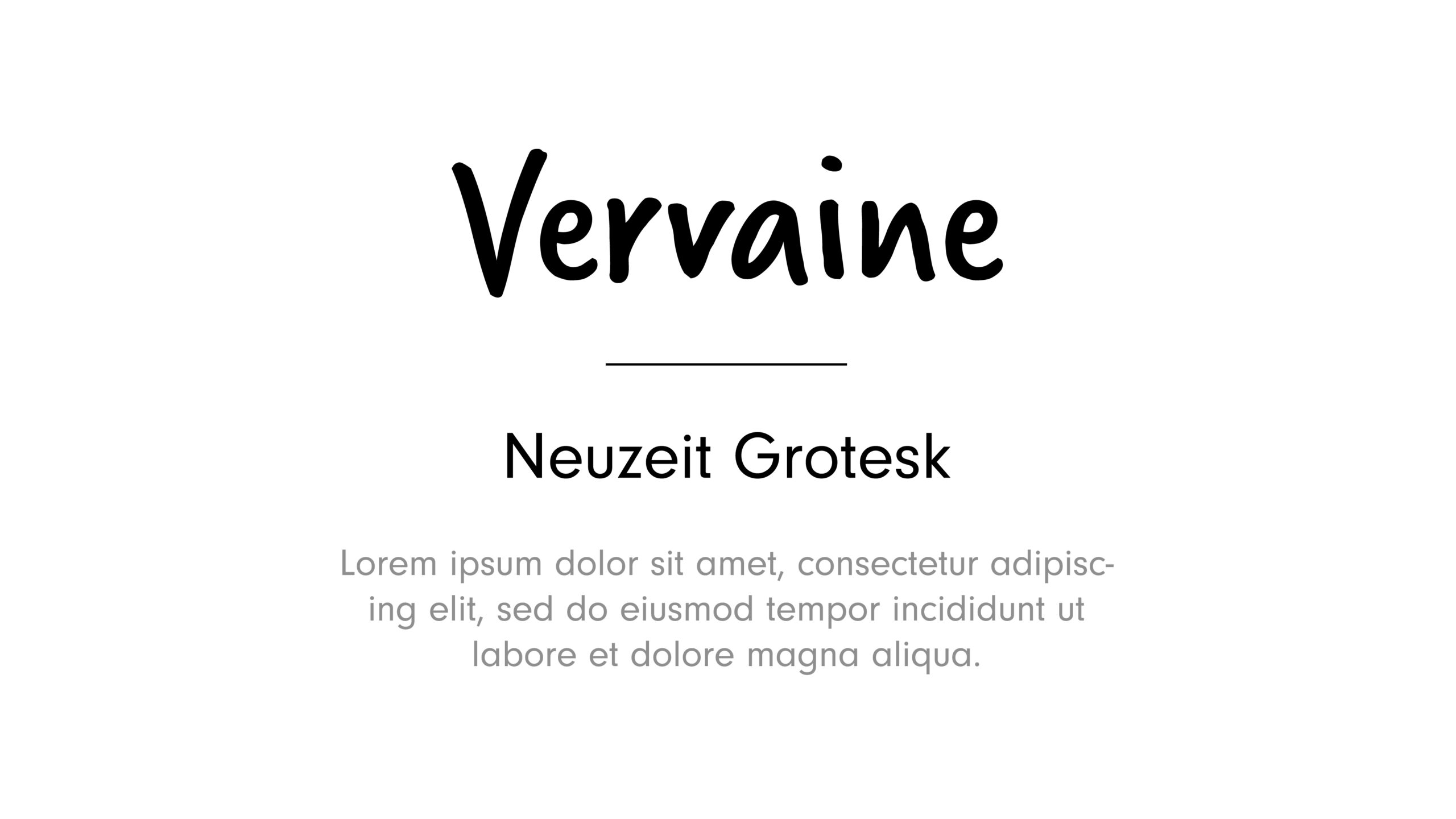
The main font for the brand was carefully chosen to appeal to a younger audience, ensuring our brand stands out while adhering to a minimalist aesthetic. This playful and engaging typography is designed to resonate primarily with children and young athletes, reflecting our brand's focus on creativity, movement, and forward-thinking. The secondary fonts are adaptable and intended for broader use.
Visual Language
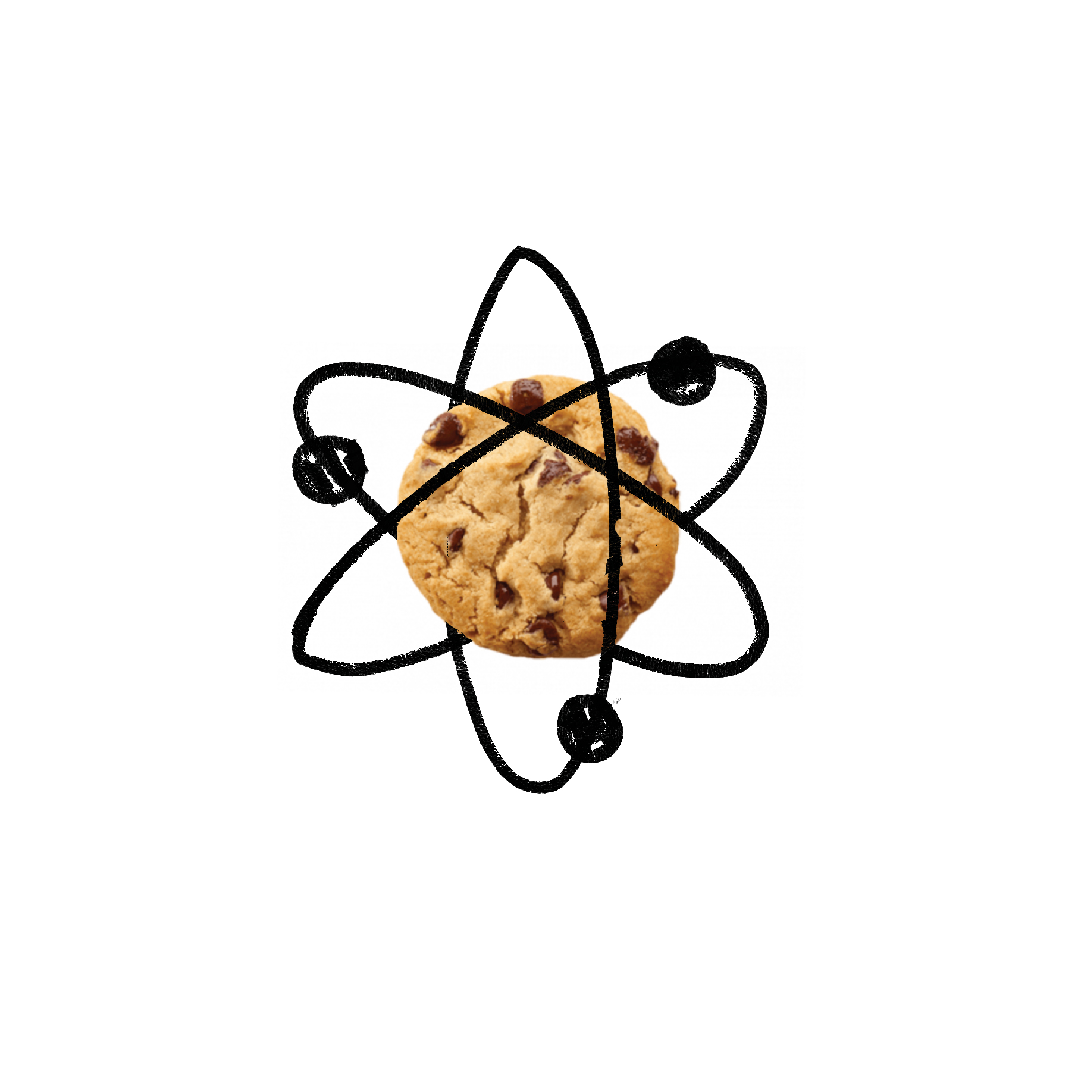
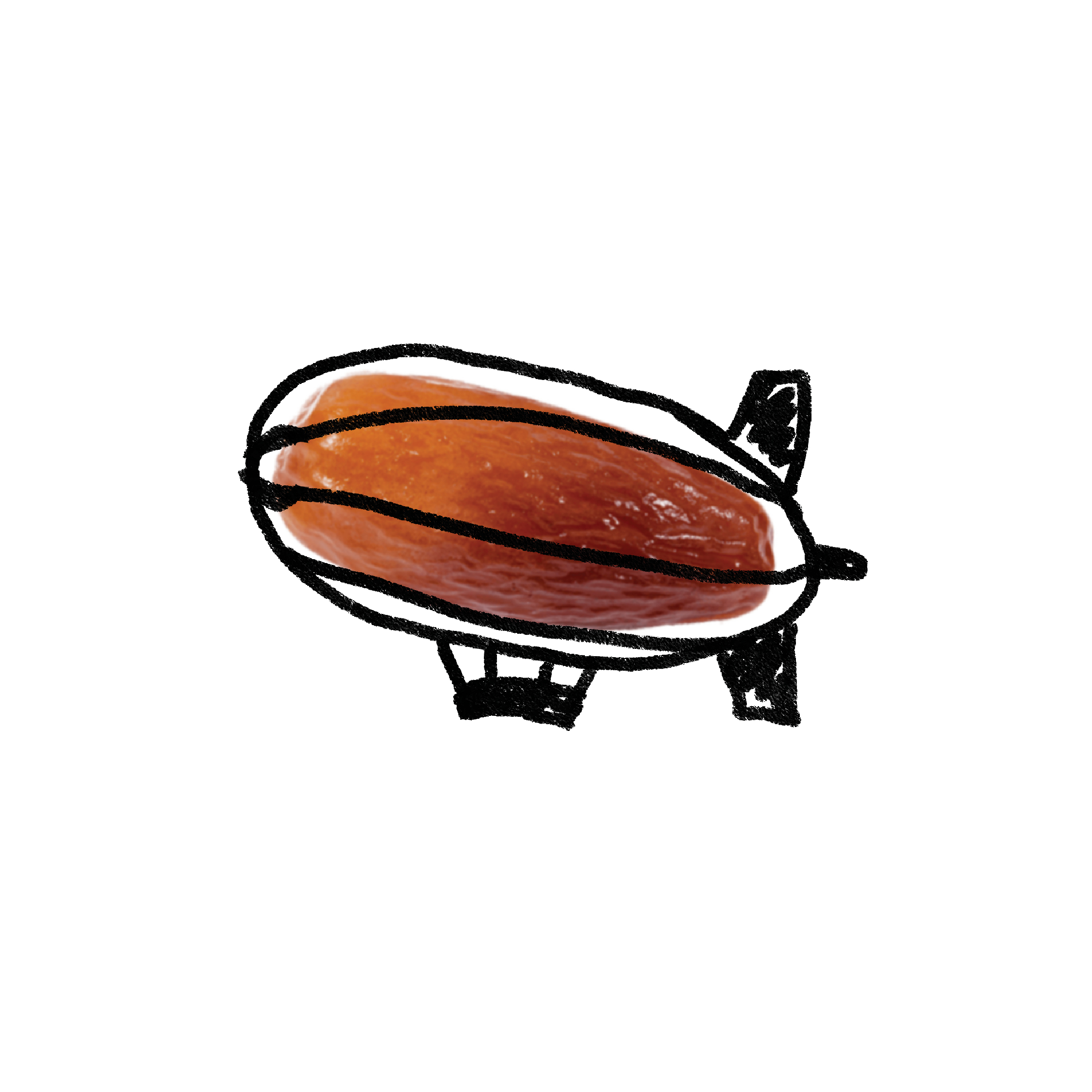
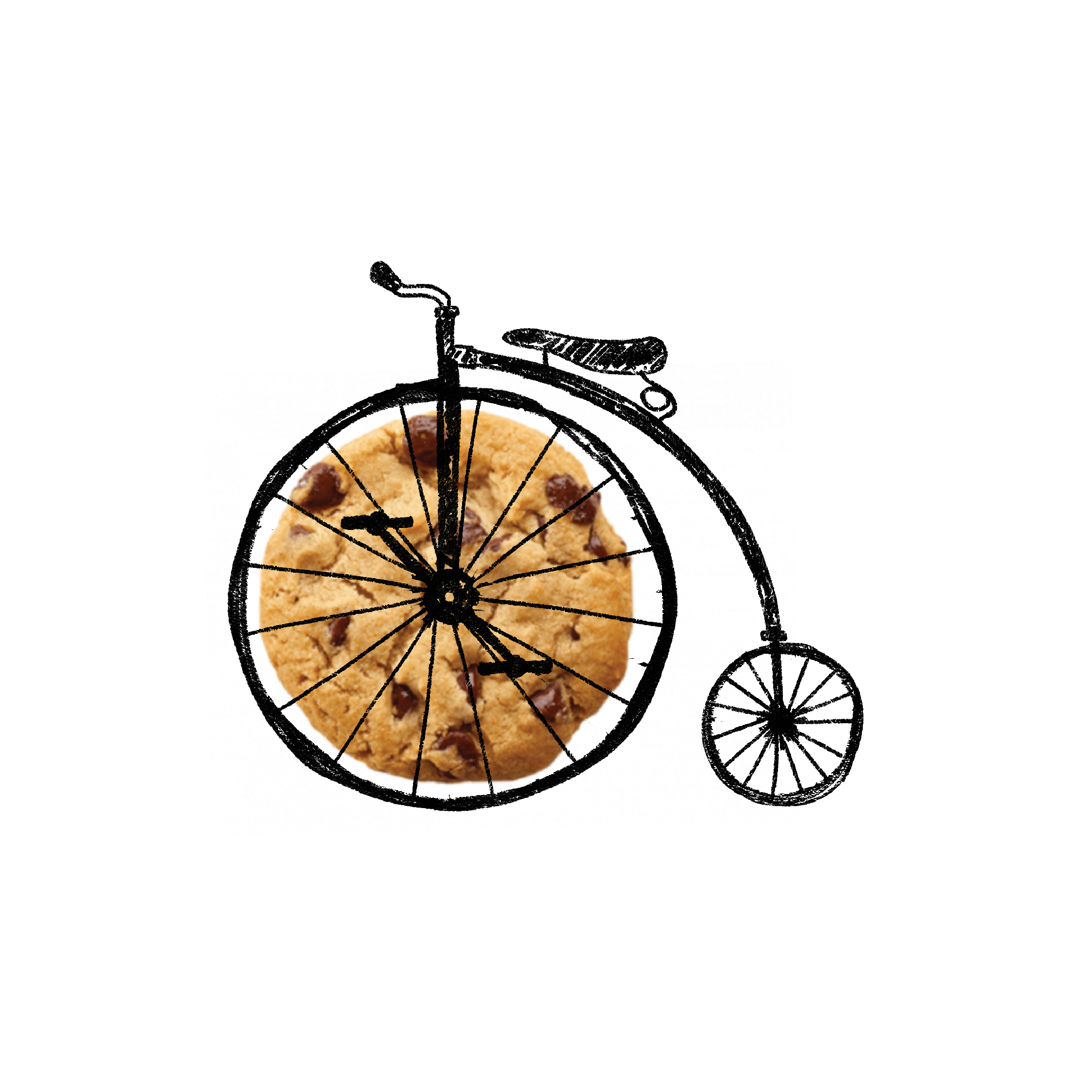
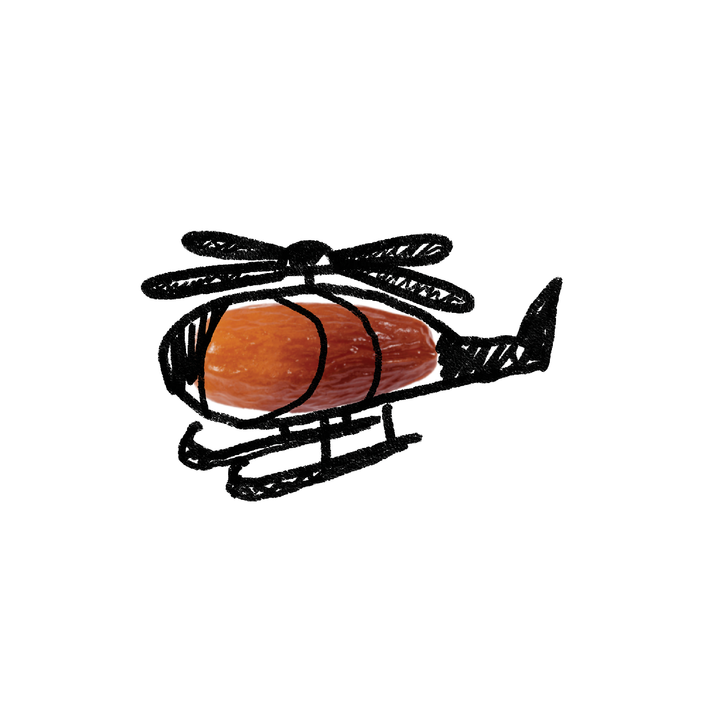
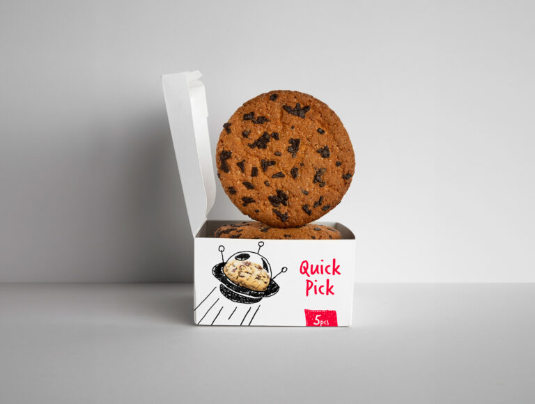
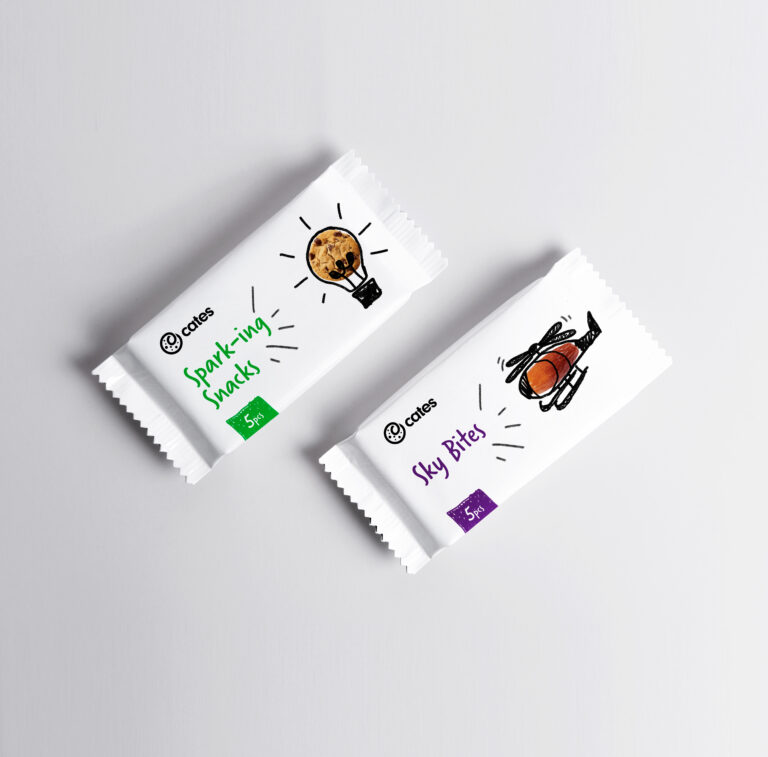
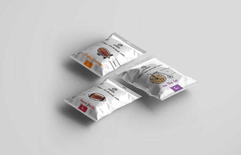
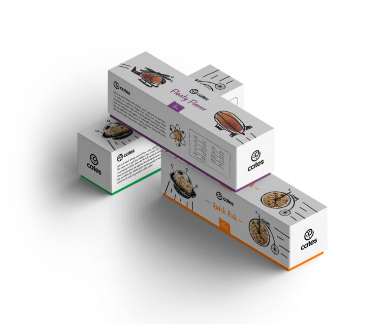
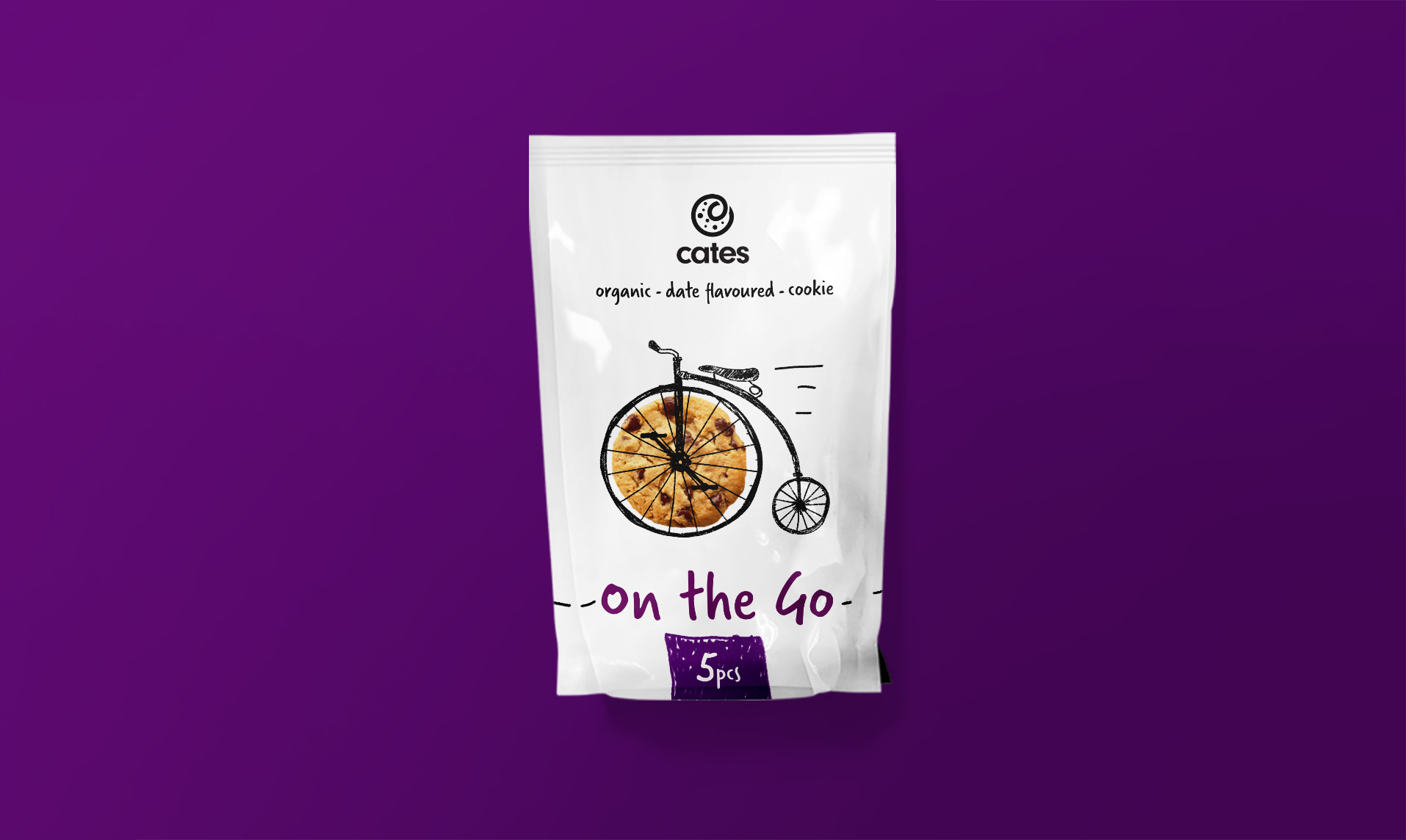
The visual language bursts with spirited symbols of activity and progress, vividly sketched with a pencil-inspired flair for creativity. Each illustration boldly features either a wholesome date or a tempting cookie, seamlessly blended into iconic symbols like a bulb for ideas, a blimp for flying, a football for sport, a helicopter for elevation, a spaceship for boundless creativity, and a bicycle for forward momentum. These lively sketches embody our brand’s dedication to innovation, movement, and the joy of wholesome snacking adventures.
