GIFTAGO
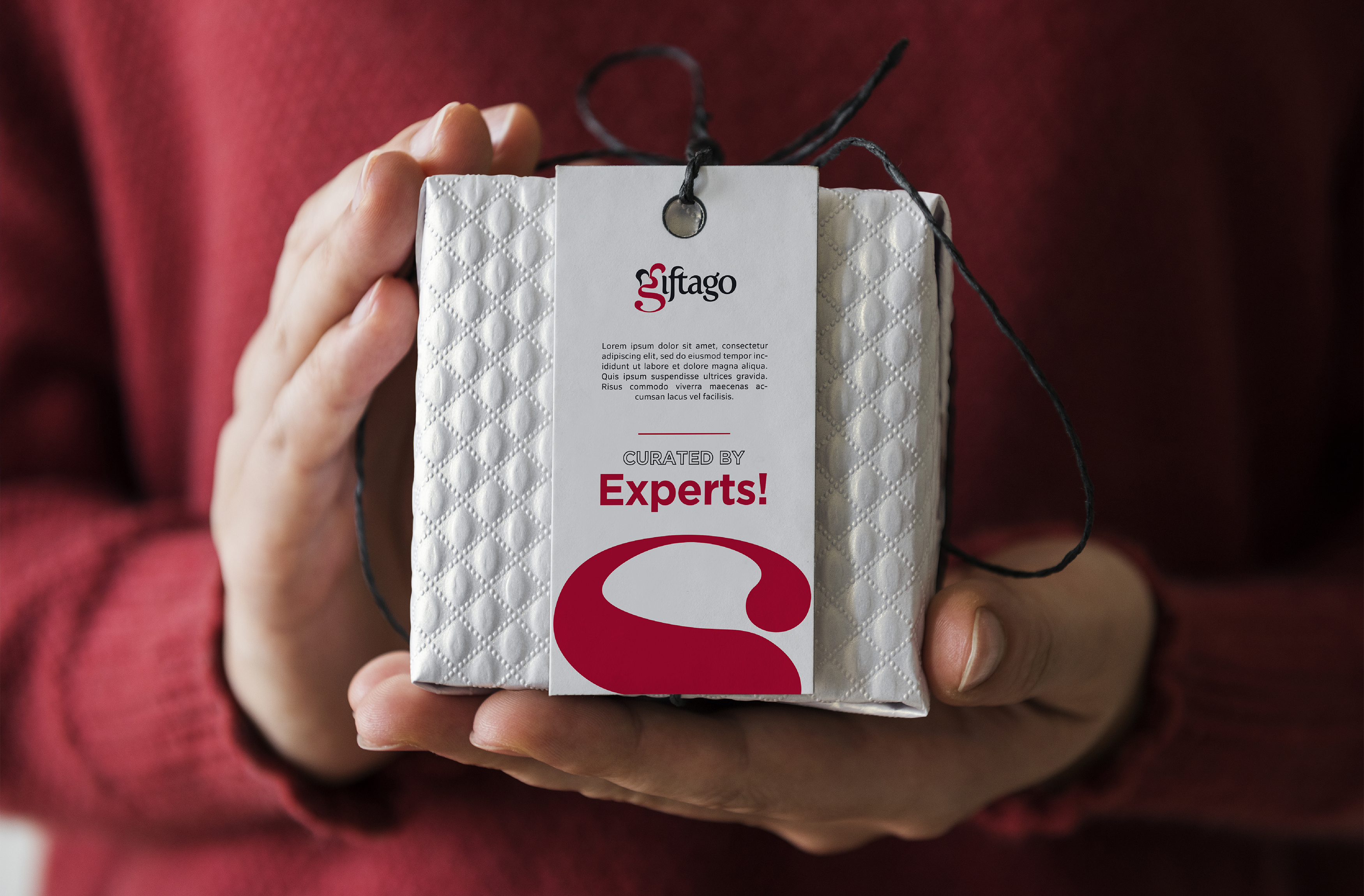
Giftago is a creative brand dedicated to enhancing relationships through unique and personalized celebrations. By offering affordable, heartfelt solutions, they help individuals express their love and joy in meaningful ways. With a focus on creativity, happiness, and exceptional service, Giftago aims to create unforgettable experiences that leave lasting memories.
Client name:
Apex Water Solutions
Partners:
Be Creative Studio
overview
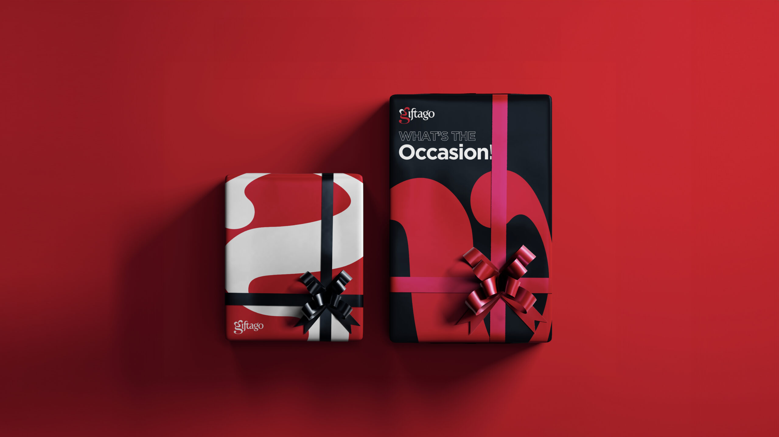
Giftago focuses on enhancing relationships through thoughtful and personalized celebrations. They provide unique, affordable solutions that make celebrations heartfelt and memorable. By guiding customers through a structured process, Giftago ensures that each celebration is an unforgettable experience, spreading joy and love one celebration at a time.
THE CHALLENGE
The challenge was to refresh an outdated logo while preserving the original concept of integrating a gear and a water drop. This required modernizing the design into a minimal, corporate format that symbolizes the fusion of water treatment technology and machinery. Additionally, a complete brand identity was developed to align with their corporate vision.
Logo Rationale
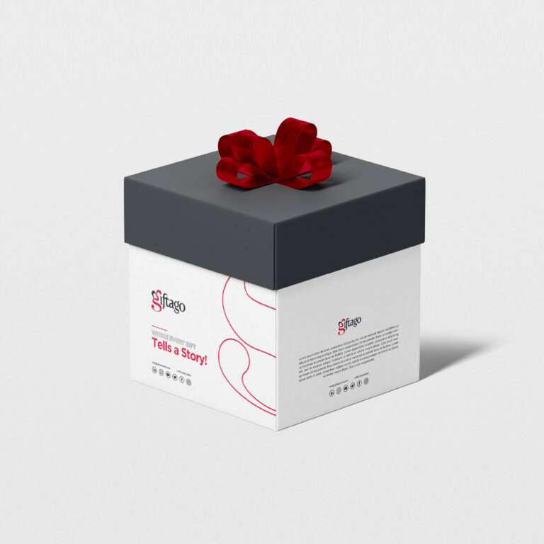
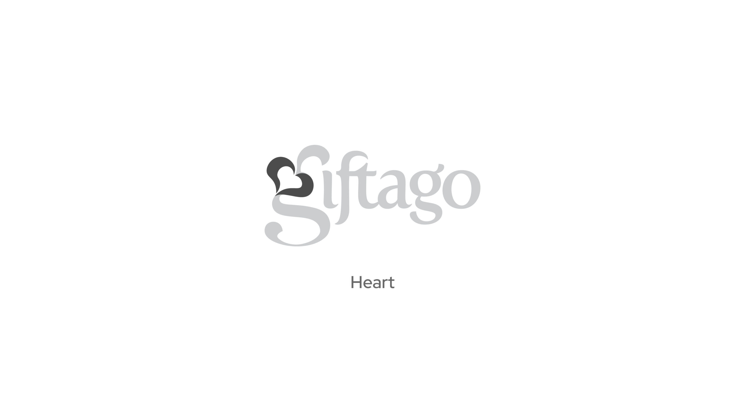
The logo is a wordmark a unique twist—the top half of the letter “g” artistically incorporates a heart. This design choice emphasizes the brand’s focus on love, care, and the personal touch they bring to celebrations. The wordmark is designed to feel inviting and expressive, aligning with Giftago’s goal of spreading joy and heartfelt connections.
Color Palette
Typography
Visual Language
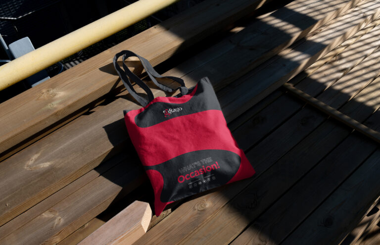
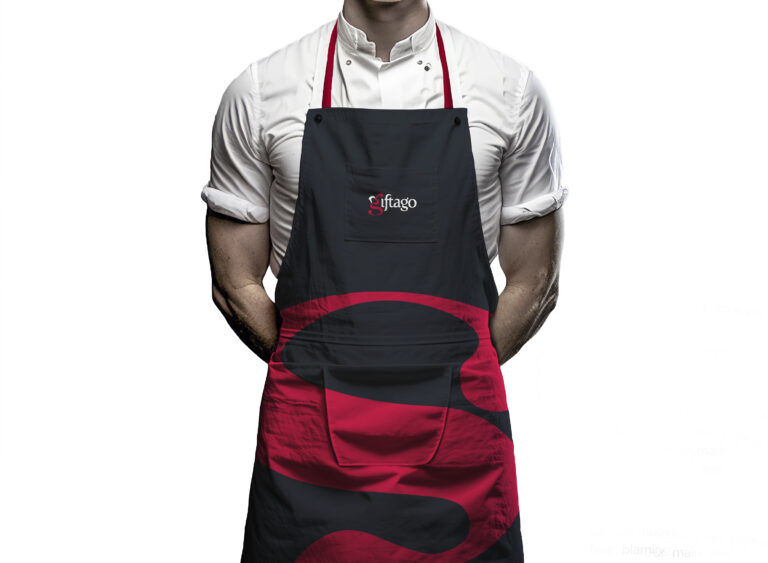
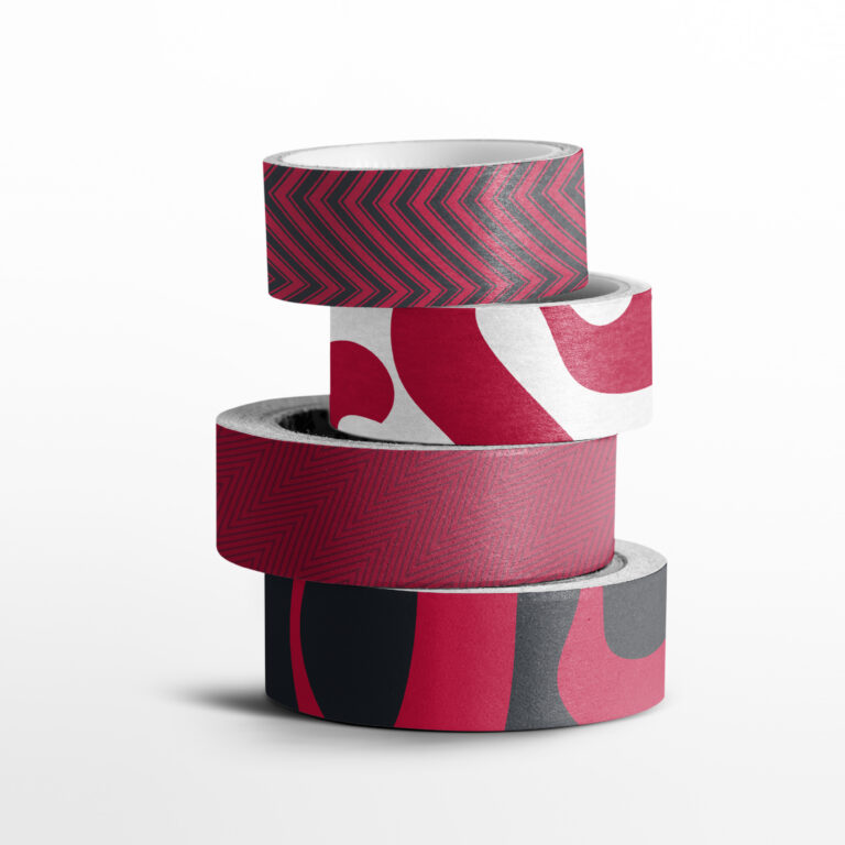
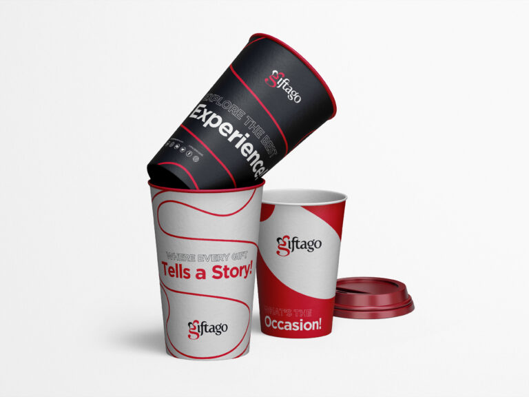
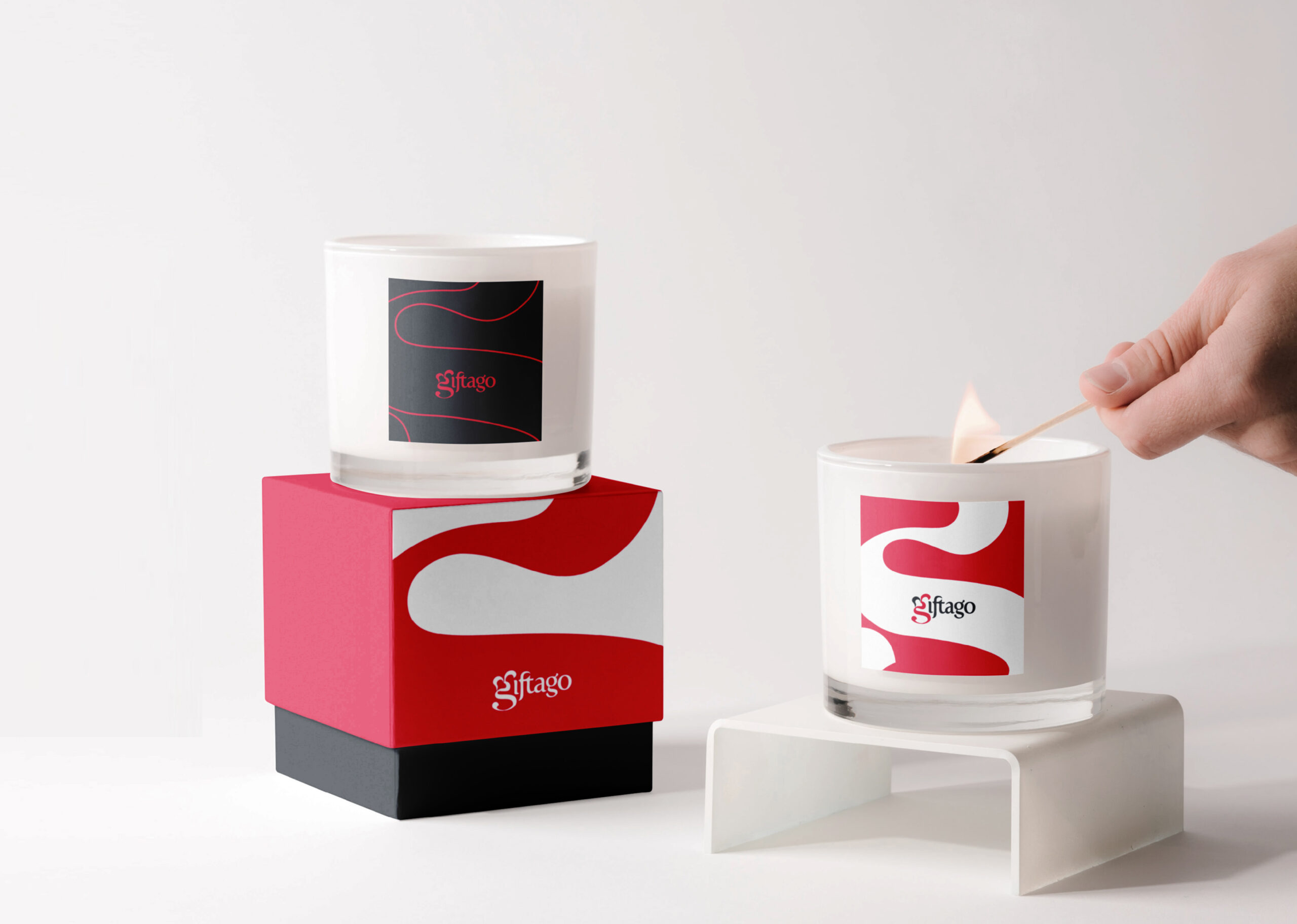
The visual language is minimal yet impactful, featuring curvy shapes to create fluid, organic forms that symbolize the flow of emotions and the natural, heartfelt connections that Giftago aims to foster in every celebration. This approach reinforces the brand’s focus on creativity and the unique, personal experiences they offer.
